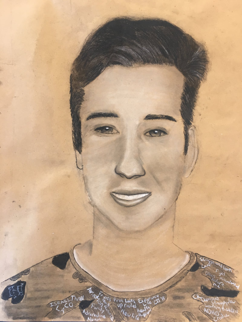
Project 1: Self Portrait Examination
1. Define which techniques you tried and mastered? Struggled?
Throughout working on this self portrate I was chalenged with the task of working with charcol. This journey of experementing with a new medium brought with it both learning skills and struggeling with tequneques. The combanation of using a new medium and testing out new tequneques of laying out my face to find its proportions allowed me to learn lessons form my stuggles. The first chalenged I faced in begining this project was that my face in the origional picture was just off centered which led to a real stuggle of structuring my face at an angle. Additionaly, the second struggle came from not having an easil. This led to my face being elongated verticaly bacause of the angle I was sitting at. However this project had its posisives too. I streingthened my skills of using value. This is prevelent in my use of darker value for shadows and the use of white charcole to highlight areas what where suseptable to direct sunlight.
2. How did you draw inspiration from other artists techniques or aesthetics in your work? In what ways did you derive meaning or gain historical perspectives from their work? Why these artists?
I began this peice in the dark of how to properaly use charcol. In order to get a sence of the different tequneces that could be aplied from studing Joel Daniel Phillips. In observing his pieces I was able to determin how charcol is able to be used to derive meaning. In Joel Daniel Phillis pieces he is extreamly detailed in the fetures of the people that he draws but additionaly leaves a sort of simplisity in the art works by leaving a blank background to leave a part of the art up to the viewers interpretation.
3. Describe the evolution of your piece. Decisions made. Compositional elements.
The evelution of my art work began with the outline. This lead to the addition of value and texture in order to turn a light scetch of the different elements of my face in to a three dementional image. As the pieve began to come together I first came in to the struggle of getting my eyes right. The different shapes and values from my face being off centered threw me off and the continouse struggle of erasing and redrawing in that area brought its own complications. Lastly, as I thought the piece was finaly coming together I took a birds eye view of the piece to only realize that using the tequnewque of drawing what I saw made the portrat dissprapotionat due to the angle that I was looking at the papar from.
4. If you could consider doing something over, explain why you would do this and what you would do next time?
If I where to redo this art work I would; one, make sure to get a proper picture of my face straight on, and two, draw using an eisle in order to get that different perseption of the art work.
5. Elaborate on how this piece links with your other pieces? What is the common thread?
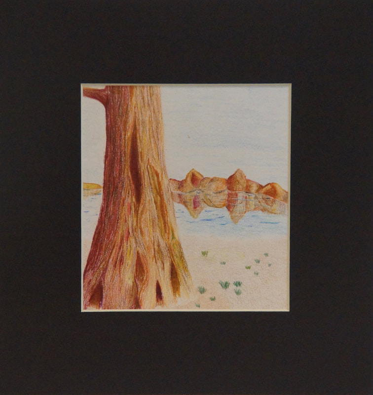
Project 2: Unknown Color
1. Define which techniques you tried and mastered? Struggled?
In this piece the complexity and yet harmony of nature is shown. The tree alone has over 20 different colors and in some places contains about 15 layers. Both of these are techniques that I tried and worked very well in the trunk. Additionally, I used several different techniques in obtaining the proper texture. The trunk required layering lines to get the texture of the bark. However, in order to get a softer feeling for the ground light circles were needed and in darker portions additional layers and some darker values where used. Some of the struggles I faced mainly included the background. I tried to keep a contrast between the center of the piece, the tree, and the rest of the piece. Because of this I tried to make the sky, mountains, and lake simpler. The background was difficult because I couldn't get the right texture or value to use in order to give the piece enough depth while also including detail.
2. How did you draw inspiration from other artists techniques or aesthetics in your work? In what ways did you derive meaning or gain historical perspectives from their work? Why these artists?
I drew inspiration from Judith Crown, an artist in Israel. By looking closely I was able to identify different stroke techniques that I tried to use. I mimicked the way that she uses many different colors in her pieces and analyzed the simplistic appearance of the piece. She is able to leave a lot of brightness to the works with out it seeming unnatural. From her work I have not only learned how powerful space is, but also understanding that silence has an unmatched power.
3. Describe the evolution of your piece. Decisions made. Compositional elements.
I began this piece and an experiment of color pencils. Starting with layering tons of colors for the trunk I quickly found that this piece would not just be a test. The trunk became a tree with branches, and then a tree in the ground. Lastly, started adding the background to create depth. Once the piece was almost done, I would return to it to get fresh eyes and add additional details.
4. If you could consider doing something over, explain why you would do this and what you would do next time?
Next time I would leave more space, I think that this piece was more powerful before I added the background, to make it more realistic. I have realized that I enjoy more abstract art rather than realistic art.
5. Elaborate on how this piece links with your other pieces? What is the common thread?
Project 3: The Lion Within
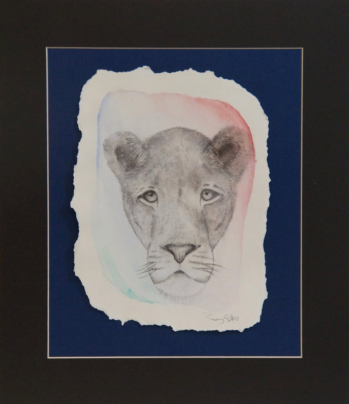
In creating this piece I mastered the use of values and space in sketching the lion with pencil. Then I contrasted the piece by playing around with water colors. Once I found the right composition of colors between the blues which symbolize truth and loyalty and the red shades which symbolisms strength and power. The balance between these two elements illustrates the lions simplicity while also showing its prominent features. In order to transfer my sketch onto the watercolor background I needed to first apply a matte gesso to the paper in order to ensure that the pigment would not come off of the paper. Then, I again applied the gesso to the watercolor paper but this time I placed a photo copied version of my sketch onto the wet gesso. This process draws the photo copied image onto the watercolor paper, and when the gesso dries you are able to rub off the paper that dried to the other paper by using water. Ultimately, you are left with the printed image which has been transferred onto the intended surface. Lastly, I created a frayed boarder to the piece to show the rustic nature of the artwork.
Final Project: An American Dream
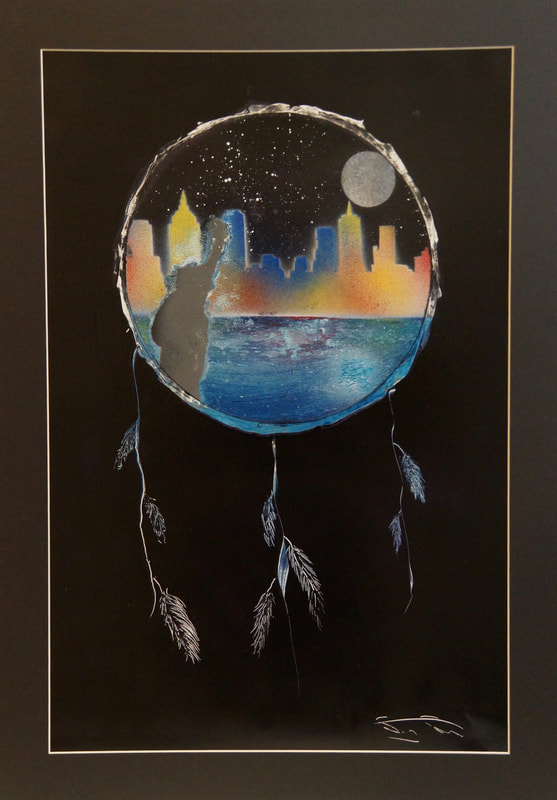
This art work brought many un expected challenges, as it was my first time using spray paint as a medium. The basic techniques of how to hold the spray paint can and what strokes to use came in a quick learning process. The more difficult techniques came in figuring out when to apply specific layers. Spray paint as a medium doesn't have a proper way of doing things, its all about getting creative in the techniques that you use. It is also very important to let certain. elements dry before adding new layers. This process can get very time consuming and requires a lot of patience. The inspiration of this piece was to incorporate street art in order to portray a new American dream. Although America might not be able to provide every new immigrant with new opportunities What America does insure is the freedom of expression and speech which is what this piece tries to portray. This piece was the result of many hopeless attempts. As this was my first piece of working with this medium I attempted every aspect of this art work independently in order to gauge what I wanted in the composition of the piece. This piece has many different stroke techniques which forms a very intestine balance as your eye is first drawn to the vibrant city skyline but then your eye its drawn from the statue of liberty to the moon and finally back down to the details of the reflective water.
Social Commentary: The Mask of Media
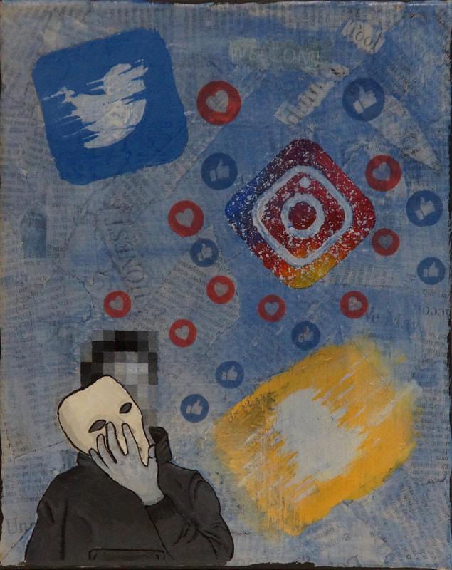
This art work incorporates several mediums in to one piece which made the process of creating an interesting contrast very difficult. First I used mod pidgin order to create a background that consisted of newspaper articles. This creates interesting details all through out my piece. Next I created a small sketch for the person in the bottom left and then with extreme detail painted it with black and white acrylic paint. This was intended to create a contrast between the mysterious character who's identity is unknown to the skewed social media logos. The skewed logos create an understanding that it is social media that has skewed the entire view of what it's like to live in this world. This effect on the individual is illustrated by the wash that covers the entire art work other than the mask, which exentuates the effect of social media on people which has made them put on a mask which is perceived in the fake identity that so many people build through social media. Lastly, the "like" and "love" symbols contrast the rest of the piece as it sits above the wash that covers the art work. This shows the repetitive cycle of decay the comes from the constant social pressure that judges the amount of likes some one gets.
Project 6: Southern Contrast
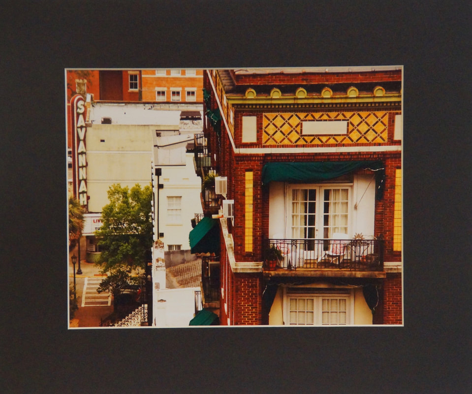
This piece involved using many different techniques of establishing a good composition and a clear photo that would be intriguing to ones eye. First, I used the rule of thirds by structuring the photo with the building balcony as the center point of the image then the tile work above draws your eye in to the photo and then finally the Savannah sign at the music club not only continues to take your eye on a journey but also established a sense of depth to the image. The clarity of the photo came by using stable hand, and the vibrate to the photo was drawn out by using a yellow polarized filter. This brings out the details of the brink and tile work while also creating a balance in an image that seems to incorporate many different components over different time periods. This image was inspired by the historical district of Savanah as in was able to incorporate the history and timeless architecture into relevant pieces of art work in the modern era.
Project 7: The Lighthouse
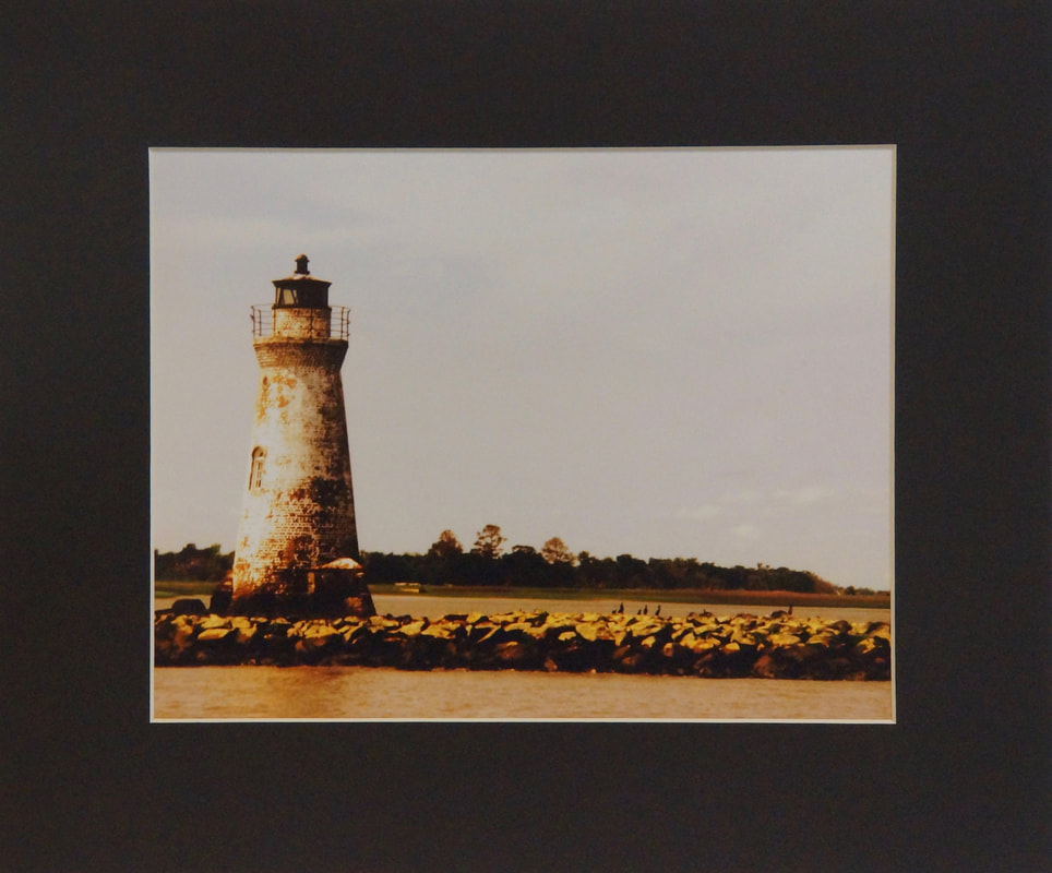
This piece was taken on a boat tour in Savannah. The light house was said to have survived huge storms and along with the rustic look I loved the potential image that I saw. One of the toughest part of getting the photo can from the fact that I was on a moving boat. Because of this the camera wouldn't focus and I needed to stabilize the camera by staying still despite the boats movements. Additionally, I then went back to edit the photo to bring out the rustic feel of the view. The main inspiration behind this piece was the idea of stability that I felt when I saw the light house. If I had the opportunity to retake this photo I would rent a boat so that I could both get the right view for the composition and that would also enable me to remain more stable.
Project 8: Meditation Tree


The inspiration behind this piece came from the the Methuselah trees in the White Mountains of California. These trees are thought to be the oldest trees alive in this day and age. This fact along with the symbolism of trees as wisdom were the main inspirations behind this piece. I merged several colors of clay together to get this marbleized feeling which looks the same as many of the Methuselah trees. Also, the person that seems to be apart of the tree, standing in tree position, represents the wholeness of the world and the stability over time. The main technique that I struggled with was ensuring that the person was visible but also still an extension of the tree. This was challenging because I needed to create deeper gashes in the clay in order to create more shadow with out separating the person from the tree.
